Databricks dashboard, launched in February 2016, is an advanced data visualization and analysis tool designed for data professionals. Seamlessly integrated within the Databricks ecosystem,these dashboards provide an intuitive interface for creating dynamic, customizable dashboards that facilitate the exploration, analysis, and sharing of insights derived from diverse data sources. The dashboard transforms raw data into clear, insightful reports, helping users make well-informed decisions based on the extracted insights.
In this article, we cover everything you need to know about Databricks dashboards, exploring its key features, functionalities, and the step-by-step process of creating and customizing your own dashboards.
What Is Databricks Dashboard?
Databricks dashboard is a powerful data visualization and analysis tool that allows users to create interactive, visually appealing dashboards within the Databricks ecosystem. It transforms raw data into actionable insights, making it easy to communicate findings and drive data-driven decisions.
What's cool about Databricks dashboard is that it works seamlessly with Databricks Notebooks. This means you can build and tweak dashboards right alongside your data workflows. Plus, with tons of chart types, widgets, and formatting options, you can transform complex data into visualizations that are easy to understand and look great too!
TL;DR: Databricks dashboard serves as a unified, collaborative space for data exploration, analysis, and reporting.
Why Use Databricks Dashboards?
So, why should you use the Databricks Dashboard? Here are a few compelling reasons:
- Data Visualization: Databricks dashboard offers a variety of chart types, including bar charts, line charts, scatter plots, maps, and more, enabling users to choose the most appropriate visualization for their data and objectives.
- Interactive Data Exploration and Analysis: Databricks dashboard's interactive nature allows users to drill down into the data, apply filters, and identify trends, facilitating a deeper understanding of the information at hand.
- Seamless Sharing and Collaboration: Databricks dashboards can be easily shared within the Databricks workspace or externally, enabling collaboration and streamlining decision-making processes.
- Real-time Monitoring and Tracking: Databricks dashboards can be set up to automatically refresh, providing users with real-time updates on KPIs, trends, and changes in their data.
- Make Data-Driven Decisions: Databricks dashboard shows your data in a clear and easy-to-understand way, so you can make smart decisions based on facts.
Databricks dashboard is tightly integrated with the broader Databricks ecosystem, tapping into Databricks' powerful data tools to turn any type of data into valuable insights for your dashboards.
Save up to 50% on your Databricks spend in a few minutes!


Available Dashboard Options in Databricks
Databricks offers two primary options for creating and managing dashboards:
- Databricks SQL Dashboards (the focus of this article)
- Databricks Lakeview Dashboards
What Is the Difference Between Databricks Dashboards and Lakeview Dashboards?
Databricks SQL Dashboards and Databricks Lakeview Dashboards are both great for data visualization and analysis, but they have some important differences.
1) Databricks SQL Dashboards (aka “Dashboards”)
As we have previously defined, Databricks SQL Dashboards (aka "Dashboards") are powerful data visualization and analysis tools that enable users to create interactive and visually appealing dashboards within the Databricks ecosystem. These dashboards facilitate data-driven decision-making by converting raw/unprocessed data into actionable insights. Users can effortlessly develop dashboards using SQL queries executed via Databricks SQL Warehouses or by adding visualizations created in Databricks Notebooks. These dashboards are adaptable for a range of data types and analytical tasks because they can be improved with interactive components like widgets, filters, and parameters.
2) Databricks Lakeview Dashboards
On the other hand, Databricks Lakeview dashboards, introduced in September 2023, is a new generation of data visualization and analytics dashboards that are optimized for ease of use, broad distribution, governance, and security. Here are some key improvements that make it stand out:
- Databricks Lakeview dashboards provides a new visualization engine that delivers beautiful, interactive charts and renders them up to ~10 times faster compared to previous dashboards.
- Databricks Lakeview dashboards introduces draft/publish capabilities, allowing dashboard authors to freely edit the dashboard while consumers interact with a stable version. Plus, you can securely share dashboards with others in your organization, even if they don't have direct access to the Databricks workspace.
- Databricks Lakeview dashboards features a What-You-See-Is-What-You-Get (WYSIWYG) interface, providing an intuitive user experience. Their streamlined information architecture bundles underlying datasets and widgets directly with the dashboard, eliminating the need to manage separate permissions for referenced queries.
- Databricks Lakeview Dashboards are fully governed by Unity Catalog, with built-in lineage, allowing users to easily understand the source and trustworthiness of the data powering the insights.
This article will focus on creating and customizing Databricks SQL dashboards (aka dashboards). Keep in mind that Lakeview dashboards, intended to replace Databricks SQL dashboards, offer a more advanced feature set, ideal for organizations with complex data analysis needs and diverse data sources.
Step-By-Step Guide to Creating a Databricks Dashboard
Now that you've got a good grasp of the Databricks dashboard, let's jump right into the step-by-step process of creating one. But first, let's quickly review the prerequisites to make sure you're all set with the right tools and resources.
Prerequisites:
To get started with the Databricks dashboard, you'll need:
- Familiarity with SQL and Databricks: To effectively work with Databricks dashboard, you should have a solid understanding of SQL and the Databricks platform.
- Access to a Databricks Workspace: To create and manage Databricks dashboards, you'll need access to a Databricks workspace. This can be either a Databricks Community Edition or a Databricks Enterprise workspace.
- Set up a Databricks Cluster: Before you can start working with your data and creating visualizations, you'll need to set up a Databricks cluster. This cluster will serve as the computing environment for your data processing and analysis tasks. Check out the Databricks Cluster Setup Guide for more in-depth info.
- Data for Visualization: Have a dataset ready, whether from Databricks or your own collection.
- Proper Permissions: You might need specific permissions to create and manage dashboards, so check your role and workspace settings.
- Data Viz Basics: While not mandatory, understanding data visualization concepts can help you create better, more engaging dashboards.
Great, you're all set! Let's get started with creating your first Databricks dashboard by following these step-by-step instructions. We'll explore the platform's features and tools along the way.
Step 1—Log in to Databricks
First, sign up or log in to your Databricks account and access your workspace.
Step 2—Create a Databricks Cluster
Next, create a Databricks cluster—the computing environment for data processing and analysis—before you can start working with data and building visualizations.
To create a new Databricks cluster, follow these steps:
- Navigate to the Compute section in your workspace sidebar.
- Click Create Compute and fill in the required details (cluster name, Databricks Runtime version, node types, ...).
- Customize settings as per your needs (auto-termination, autoscaling).
- Click Create Cluster and wait for it to be ready.
Check out this step-by-step guide to create Databricks Cluster.
Note that the cluster creation process may take a few minutes to complete. Once the cluster is up and running, you can proceed to the next step.
Step 3—Create a Databricks Notebook
Databricks Notebooks are integral to creating visualizations that will be added to Databricks SQL Dashboards. These notebooks provide an interactive environment where you'll perform data processing, analysis, and visualization tasks.
To create a new Databricks Notebook, follow these steps:
- Head over to the Workspace section in your Databricks environment.
- Find the right folder and click "Create", then choose "Notebook".
- Name your notebook, select your cluster, and pick your preferred language (SQL, Python, Scala, R).
Check out this step-by-step guide to create Databricks Notebook.
Once your Databricks notebook is created, you can start building your Databricks dashboard by following the subsequent steps.
Step 4—Setup and Data Preparation
Now that you have a Databricks cluster and a notebook set up, it's time to load and explore the data you want to visualize in your dashboard.
Let's use the NYC Taxi trip dataset for this guide. It's a publicly available dataset with around ~83-84 million rows of taxi trip data, perfect for creating a dashboard and visualizing data.
First things first, we'll set up a database and table, then load the dataset into the table:
CREATE DATABASE IF NOT EXISTS databricks_dashboard_demo_db;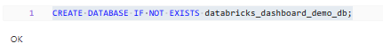
CREATE TABLE databricks_dashboard_demo_db.taxi_dataset
AS SELECT * FROM delta.`/databricks-datasets/nyctaxi/tables/nyctaxi_yellow/`;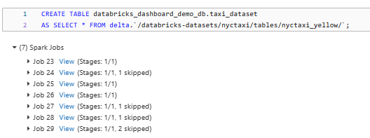
As you can see, this query creates a new table called taxi_dataset in the databricks_dashboard_demo_db database, and populates it with the data from the NYC Taxi trip dataset.
Step 5—Preprocess and Refine the Data
Now with our raw data loaded, the next step is to clean it up and prepare it for effective visualization. This involves handling any missing values, converting data types as needed, and creating new columns that will help us derive more meaningful insights.
Here's an example of how you can preprocess and refine the data:
CREATE TABLE databricks_dashboard_demo_db.taxi_dataset_refined
AS
SELECT
  vendor_id,
  to_timestamp(pickup_datetime) AS pickup_datetime,
  to_timestamp(dropoff_datetime) AS dropoff_datetime,
  to_date(pickup_datetime) AS pickup_date,
  to_date(dropoff_datetime) AS dropoff_date,
  passenger_count,
  trip_distance,
  pickup_longitude,
  pickup_latitude,
  dropoff_longitude,
  dropoff_latitude,
  payment_type,
  tip_amount,
  tolls_amount,
  fare_amount,
  CAST((to_timestamp(dropoff_datetime) - to_timestamp(pickup_datetime)) AS INT) AS trip_duration,
  total_amount
FROM databricks_dashboard_demo_db.taxi_dataset
WHERE passenger_count IS NOT NULL
  AND trip_distance IS NOT NULL
  AND fare_amount IS NOT NULL;
This query performs several data cleaning and transformation steps:
- First, it converts the pickup_datetime and dropoff_datetime fields to standard timestamps, which are easier to work with.
- It also creates new, separate columns for pickup_date and dropoff_date from the timestamps.
- The query then calculates the trip_duration_seconds for each trip by finding the difference in Unix timestamps between the dropoff and pickup times, providing a precise duration in seconds.
- Lastly, it filters out any rows that have missing data in critical columns, such as passenger_count, trip_distance, and fare_amount, ensuring data quality.
After running this query, we'll have a nice, clean dataset called taxi_dataset_refined, which we can use to create visualizations and explore the data in our Databricks dashboard.
Step 6—Exploring Sample Data
Now that we have our data in place, let's take a moment to look at what's inside our taxi_dataset and taxi_dataset_refined tables. To do this, create a new cell in your Databricks Notebook and run the following queries:
SELECT * FROM databricks_dashboard_demo_db.taxi_dataset;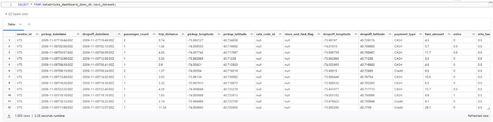
SELECT * FROM databricks_dashboard_demo_db.taxi_dataset_refined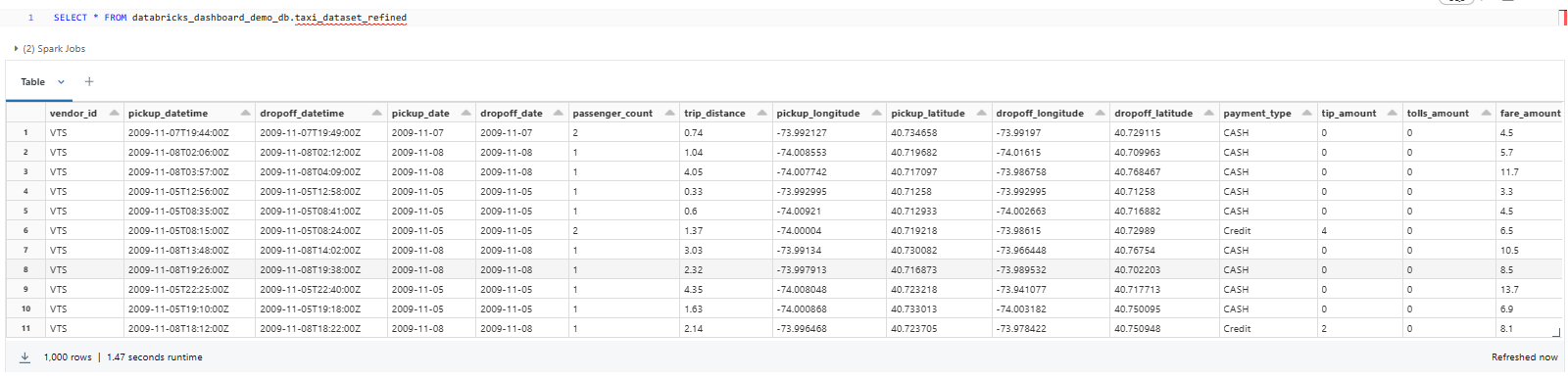
Take some time to explore the dataset, understand its columns, and identify the data that you'll use for your dashboard visualizations.
Once you've explored the data, you can start creating visualizations to gain insights from the dataset.
Step 7—Visualize the Data
Let's dive into visualizing the data with a chart! We'll start by writing a SQL query to group the data by passenger count and determine the number of records for each count value. This will provide insight into how many rides had a specific number of passengers.
Here's the query to get started:
SELECT passenger_count, COUNT(*) AS count FROM databricks_dashboard_demo_db.taxi_dataset_refined GROUP BY passenger_count ORDER BY passenger_count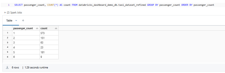
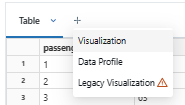
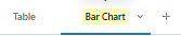
By default, the output will be a data table. But don't worry—we can easily create a chart from this data! Just click the "+" icon next to the "Table" and select the "Visualization" option. You'll see a chart generated using the query results.
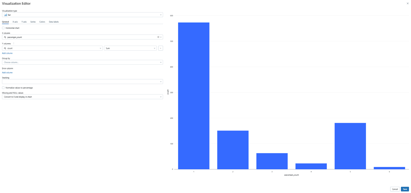
You now have a simple visualization of the passenger count data. Feel free to explore different chart types and formats to find the best way to present your insights. We'll cover more customization options later, but for now, experiment with the available settings to see what works best for your dataset.
Step 8—Add Filters Using Databricks Widgets
Let's dive into creating interactive dashboard filters using Databricks widgets! Widgets are interactive input elements that can be added to your notebooks and dashboards to parameterize them, making them more reusable and dynamic. Databricks offers four built-in widget types:
- Text Input: This widget lets you capture single or multi-line text input, which is helpful for simple filtering or setting parameters.
- Dropdown: The Dropdown widget provides a menu with a list of options to choose from, making it perfect for predefined categories and options.
- Combo Box: This widget combines a text box with a drop-down menu, allowing users to either type in a custom value or select an option from the list.
- Multiselect: The Multiselect widget displays a list with checkboxes, enabling users to select multiple options for flexible filtering and data segmentation.
For this guide, we'll focus on the Text widget, but you're encouraged to experiment with other types to find the best fit for your dashboard.
Creating a text widget using simple SQL is very easy! All you need to do is use the CREATE WIDGET TEXT statement.
Here's an example of how to create two text widgets called start_date and end_date with default values of "2009-11-01" and "2009-11-30", respectively:
CREATE WIDGET TEXT start_date DEFAULT "2009-11-01";
CREATE WIDGET TEXT end_date DEFAULT "2009-11-30";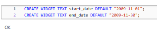
Now, let's write a query that queries the taxi_dataset_refined table based on the pickup date range specified by the widget values.
SELECT passenger_count, COUNT(*) AS trip_count
FROM databricks_dashboard_demo_db.taxi_dataset_refined
WHERE to_date(pickup_datetime) BETWEEN to_date(getArgument('start_date')) AND to_date(getArgument('end_date'))
GROUP BY passenger_count
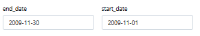
ORDER BY passenger_count;You should now see the visualization updated with data filtered according to the default date range. Also, you'll notice two new widgets appearing at the very top of your notebook, allowing you to adjust the start and end dates and observe the visualization update in real-time.
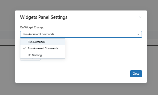
If you want to configure Databricks Widget click the settings ⚙️ icon on the far right of the Widgets panel. This opens the Widget Panel Settings dialog box. Under "On Widget changes", choose the widget's execution behavior:
- Run Notebook: Select this option to rerun the entire notebook whenever you pick a new value in a widget.
- Run Accessed Commands: This is the default setting. When selected, only the cells that use the widget's value will rerun when you change the value. The rest of the notebook will remain unchanged.
- Do Nothing: Choose this option if you don't want any cells to rerun when a widget's value changes.
Now, your Databricks Widget is set up to behave exactly the way you want it to when you change values in the widget!
Step 9—Customize the Visualization
Databricks offers a rich set of visualization options, allowing you to explore and gain meaningful insights from your data. Each chart type provides a unique perspective, highlighting different aspects of your dataset. Let's delve into the process of customizing your visualizations using various chart types.
1) Bar Chart:
Let's start with a bar chart. Bar charts are effective for displaying categorical data, allowing you to visualize trends and compare values across different categories. In this example, we'll create a bar chart to visualize the average trip distance for different passenger counts.
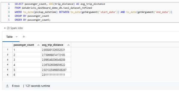
SELECT passenger_count, AVG(trip_distance) AS avg_trip_distance
FROM databricks_dashboard_demo_db.taxi_dataset_refined
WHERE to_date(pickup_datetime) BETWEEN to_date(getArgument('start_date')) AND to_date(getArgument('end_date'))
GROUP BY passenger_count
ORDER BY passenger_count;
As you can see, this query retrieves the average trip distance (AVG(trip_distance)) for each passenger count (passenger_count) from the taxi dataset. It filters the results between the specified start and end dates and groups them by passenger count.
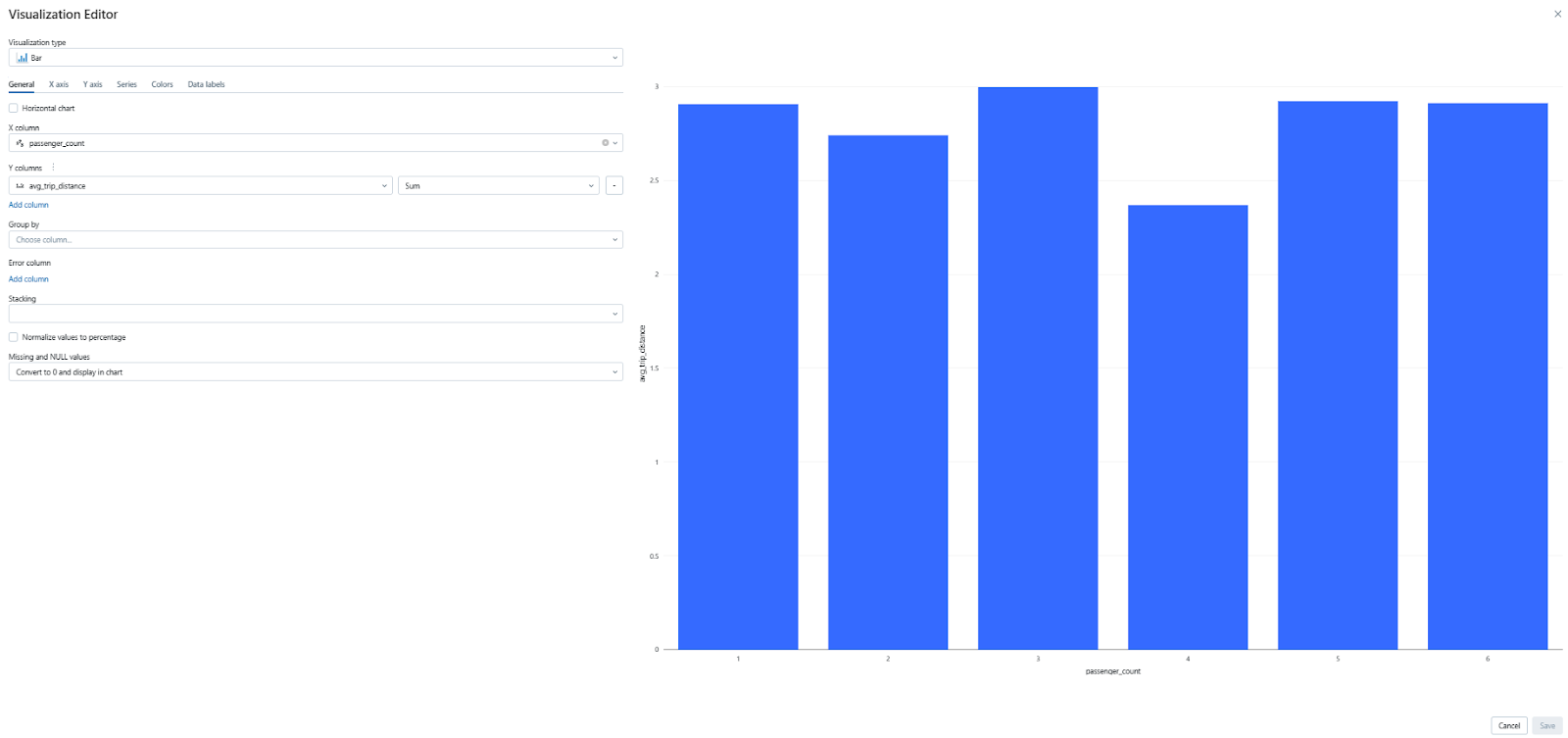
Once you execute the query, you'll see the data displayed in a table format. To visualize the data as a bar chart, simply click on the plus icon next to the table and select the "Visualization" option. From there, click on the "Visualization type" drop-down menu and then select the "Bar Chart" option. This will generate a bar chart that displays the average trip distance for each passenger count.
2) Scatter Chart:
Scatter plots are useful for exploring the relationship between two numerical variables. They can help you identify correlations and patterns in your data. Let's create a scatter plot to visualize the relationship between trip distance and total amount, categorized by passenger groups.
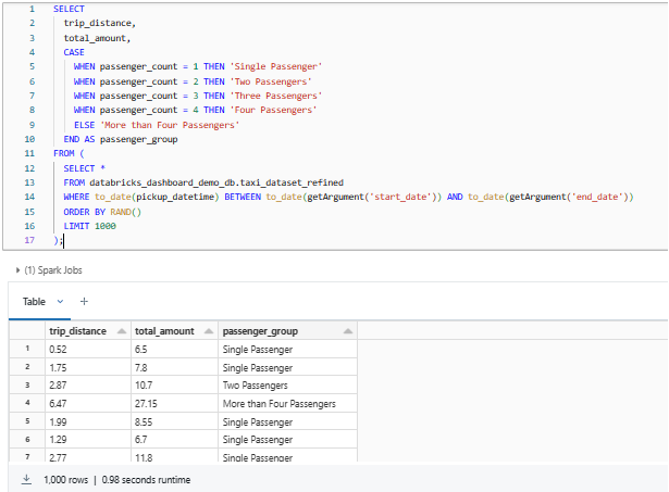
SELECT
  trip_distance,
  total_amount,
  CASE
    WHEN passenger_count = 1 THEN 'Single Passenger'
    WHEN passenger_count = 2 THEN 'Two Passengers'
    WHEN passenger_count = 3 THEN 'Three Passengers'
    WHEN passenger_count = 4 THEN 'Four Passengers'
    ELSE 'More than Four Passengers'
  END AS passenger_group
FROM (
  SELECT *
  FROM databricks_dashboard_demo_db.taxi_dataset_refined
  WHERE to_date(pickup_datetime) BETWEEN to_date(getArgument('start_date')) AND to_date(getArgument('end_date'))
  ORDER BY RAND()
  LIMIT 1000
);
This query categorizes the passenger counts into groups and retrieves the trip distance, total amount, and passenger group for each row. The results are filtered by the specified date range, randomly ordered, and limited to 1000 rows.
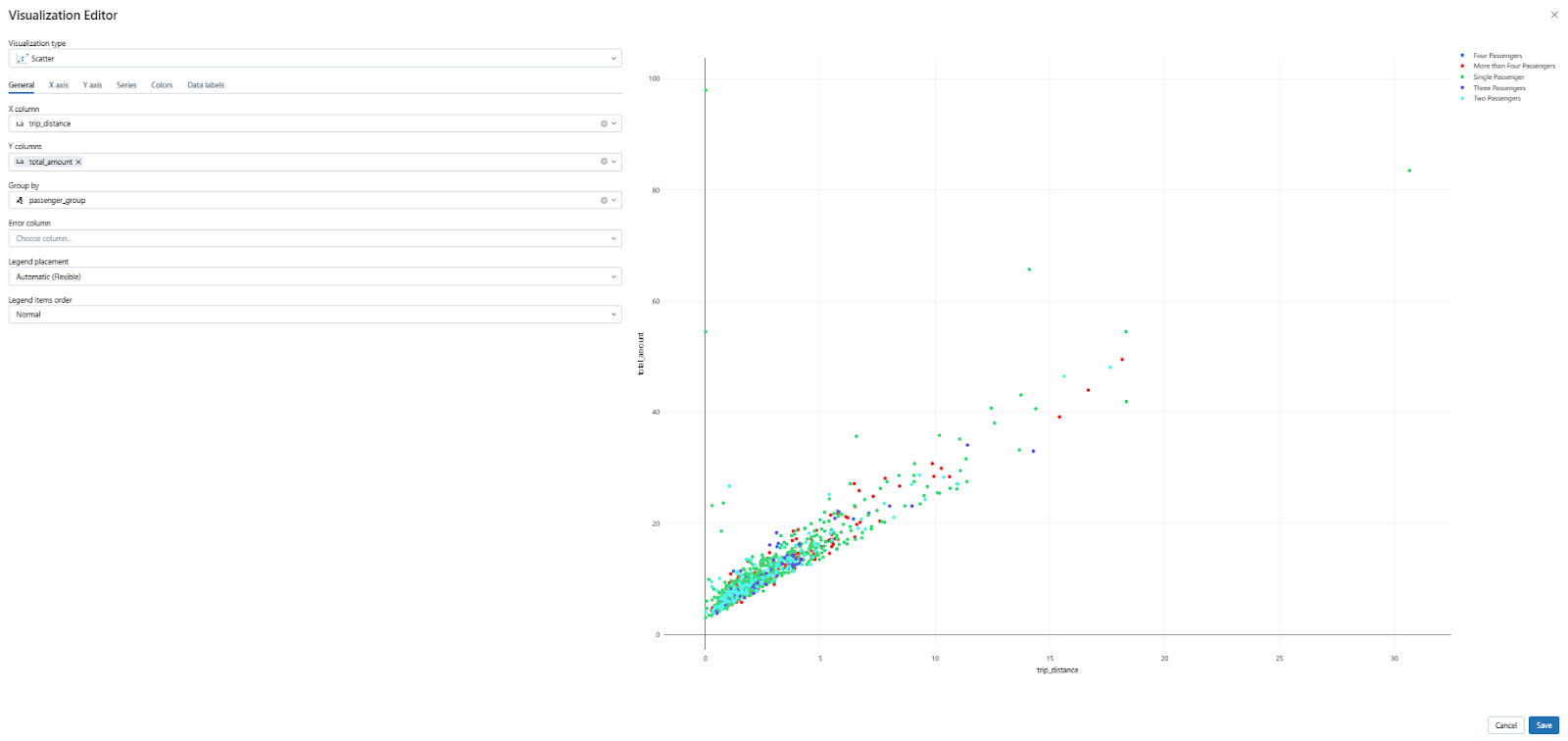
To create the scatter plot, follow the same steps as the bar chart: click the "+" icon, select "Visualization", and choose the "Scatter Chart" option from the "Visualization type" dropdown.
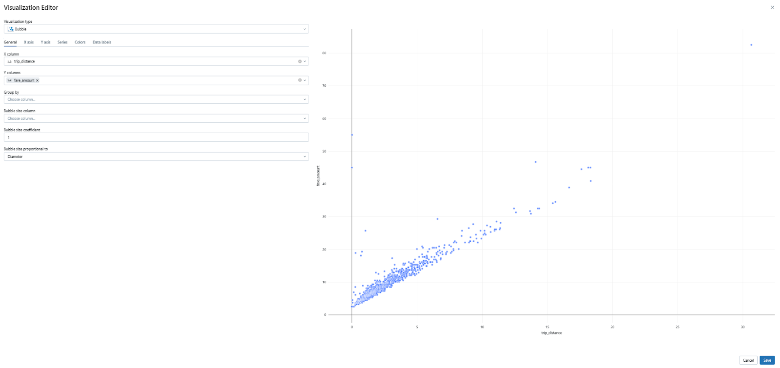
3) Bubble Chart:
Bubble charts are an extension of scatter plots, introducing a third variable represented by the size of each bubble. This allows you to visualize three dimensions of data simultaneously. For example, you could use a bubble chart to plot trip distance and fare amount, with passenger_count determining the bubble size. The query would look like this:
SELECT
  trip_distance,
  fare_amount
FROM (
  SELECT *
  FROM databricks_dashboard_demo_db.taxi_dataset_refined
  WHERE to_date(pickup_datetime) BETWEEN to_date(getArgument('start_date')) AND to_date(getArgument('end_date'))
  ORDER BY RAND()
  LIMIT 1000
);
This query selects the trip_distance, fare_amount, and passenger_count columns from the taxi_dataset_refined table, filtered by the specified date range. The results are randomly ordered and limited to 1000 rows. In the visualization settings, you would then map passenger_count to the bubble size dimension.
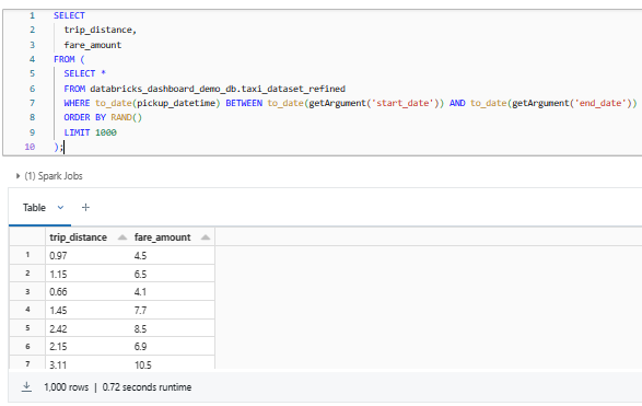
To create the bubble chart, repeat the same process as before: click on the "Visualization" option next to the table and choose the "Bubble Chart" type.
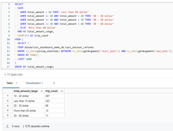
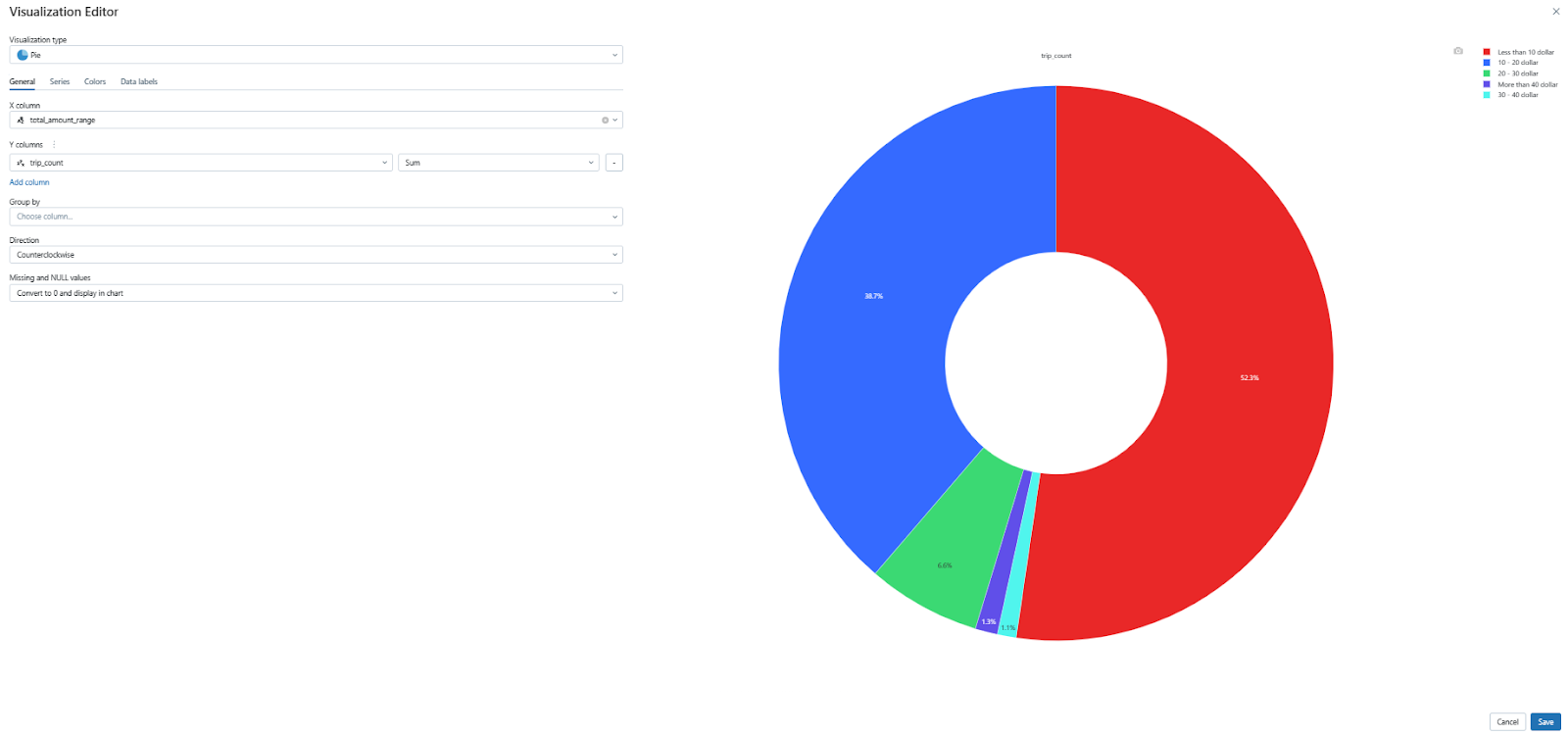
4) Pie Chart:
Pie charts are effective for visualizing the proportional distribution of categorical data. In this example, we'll create a pie chart to show the distribution of trips across different total amount ranges.
SELECT
  CASE
    WHEN total_amount < 10 THEN 'Less than 10 dollar'
    WHEN total_amount >= 10 AND total_amount < 20 THEN '10 - 20 dollar'
    WHEN total_amount >= 20 AND total_amount < 30 THEN '20 - 30 dollar'
    WHEN total_amount >= 30 AND total_amount < 40 THEN '30 - 40 dollar'
    ELSE 'More than 40 dollar'
  END AS total_amount_range,
  COUNT(*) AS trip_count
FROM (
  SELECT *
  FROM databricks_dashboard_demo_db.taxi_dataset_refined
  WHERE to_date(pickup_datetime) BETWEEN to_date(getArgument('start_date')) AND to_date(getArgument('end_date'))
  ORDER BY RAND()
  LIMIT 1000
)
GROUP BY total_amount_range;
This query categorizes the total amount into different price ranges and counts the number of trips in each range.
Now, creating a pie chart is as simple as the previous charts you've made. Once again, click on the “Visualization” option next to the table, then select the “Scatter Chart” type.
After you've chosen or created your desired chart, don't forget to save your visualization by clicking on the save button.
Remember, these are just a few examples of the many chart types available in Databricks. Feel free to experiment and find the visualizations that best suit your data and analysis needs.
Step 10—Add the Visualization to the Databricks Dashboard
Now that you have created various visualizations, let's add them to a Databricks dashboard. First, you'll need to create a new dashboard. Follow these step-by-step instructions to guide you through the process:
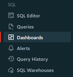
First, start by clicking on the Dashboards icon in the sidebar.
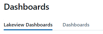
You'll see two tabs—"Lakeview Dashboards" and "Dashboards." Click on the "Dashboards" tab.
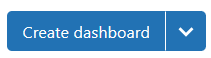
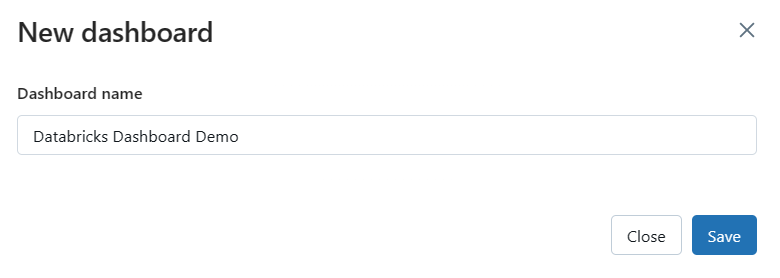
To create a new dashboard, click on the "Create Dashboard" button located at the top of the page. A pop-up window will appear.
In the pop-up window, provide a name for your dashboard that reflects the purpose or theme of your visualizations.
Now that you've created visualizations and a dashboard, and now it's time to bring them together. To do this, go to your Databricks notebook and locate the visualizations you've created earlier.
Click on the drop-down menu and select "Add to dashboard". Choose the dashboard you just created—and voila! The visualization will appear on the dashboard.
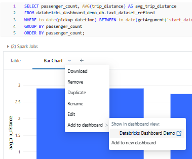
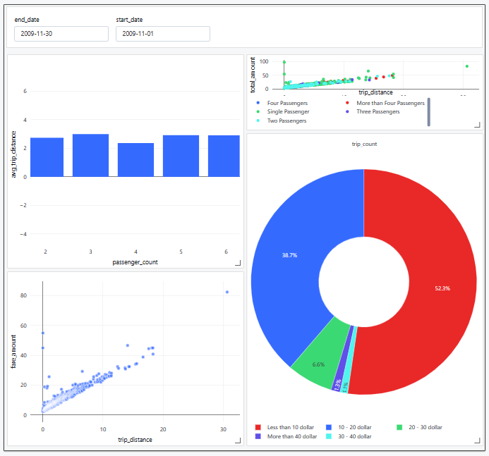
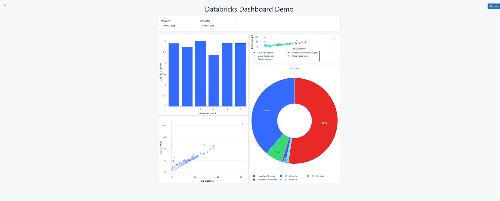
Follow the same steps for all the other charts you've created, such as the scatter plot, bubble chart, and pie chart. Once you've added all of them, your dashboard will begin to take shape, something like this:
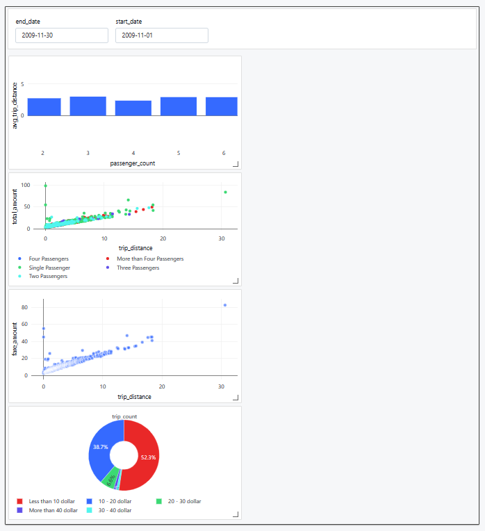
Step 11—Customize the Databricks Dashboard
Now that you have your initial visualizations on the Databricks dashboard, it's time to personalize the layout and appearance. Don't worry; it's pretty straightforward!
1) Rearranging and Resizing Elements
Click and drag the visualizations, widgets, and other elements around the dashboard to arrange them in the desired order.
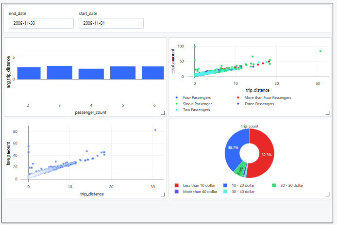
To resize an element, simply click on its bottom-right corner and drag it to the desired size.
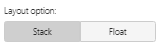
2) Adjusting Dashboard Layout Options
Databricks dashboard offers two layout options—"Stack" and "Float". Use the "Stack" layout to keep elements neatly aligned, or choose "Float" for flexible positioning. Switch between layout options by clicking the corresponding button in the right-hand panel of the dashboard.
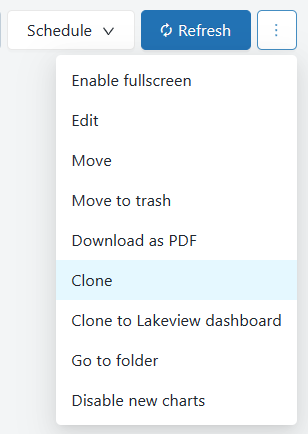
Step 12—Clone a Databricks Dashboard
Cloning a dashboard and its upstream queries is a breeze, as long as you have the right permissions (like CAN RUN, CAN EDIT, and CAN MANAGE).
Just keep in mind that sharing settings, alerts, and subscriptions won't be copied to the new dashboard.
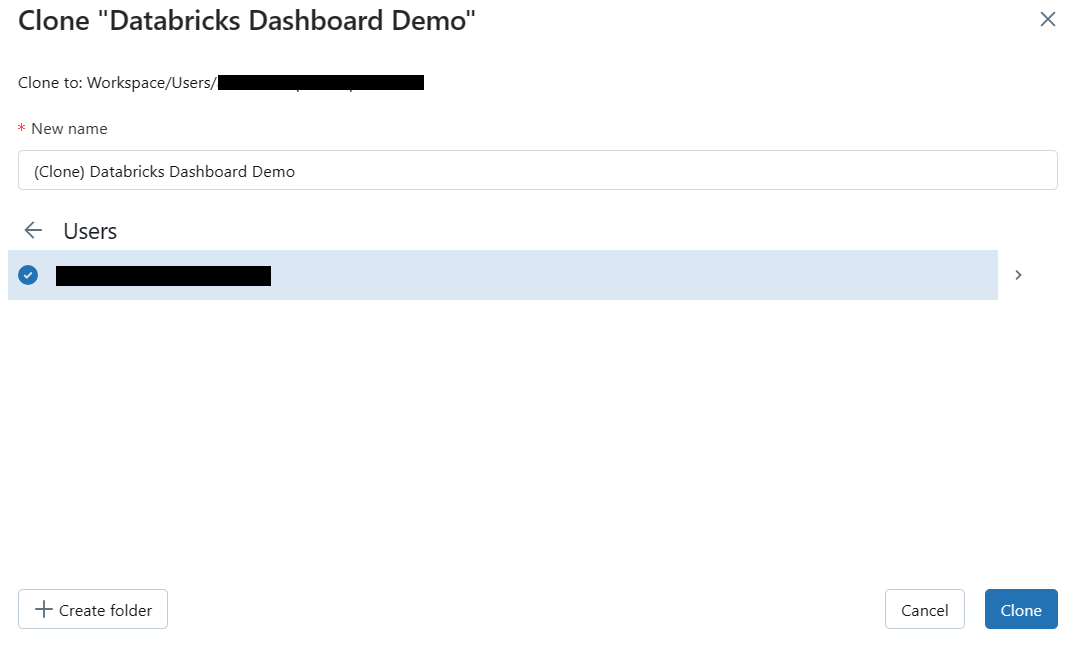
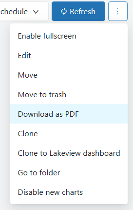
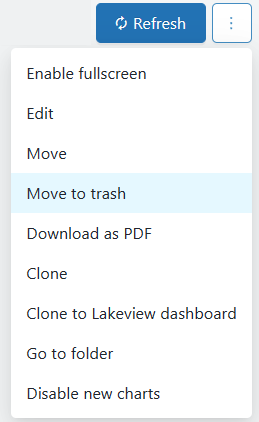
To clone your dashboard, open the kebab menu at the top-right corner of the dashboard, select Clone, enter a name, and click Confirm.
Step 13—Present the Databricks Dashboard
When you're ready to share your Databricks dashboard with others, you can present it in full-screen mode. This is particularly useful for meetings, presentations, or demonstrations, as it allows you to focus the audience's attention on the dashboard content.
To present a Databricks dashboard, follow these steps:
- Open the dashboard you want to present.
- Click the "Present Dashboard" button in the top-right corner of the dashboard.
Your dashboard will now appear in full-screen mode, hiding all surrounding elements and focusing solely on the dashboard content. You can still interact with the dashboard in full-screen mode, including applying filters, exploring data, and navigating between visualizations. To exit full-screen mode, click the "Exit" button located in the top-left corner.
Step 14—Manually/Automatically Refresh Databricks Dashboard
To make sure your Databricks dashboard remains up-to-date, you can manually or automatically refresh its content.
1) Manually Refresh the Databricks Dashboard
To manually refresh the dashboard, click the "Update" button in the top-right corner of the dashboard. This will rerun all the queries associated with the dashboard and update the visualizations with the latest data.
2) Automatically Refresh the Dashboard
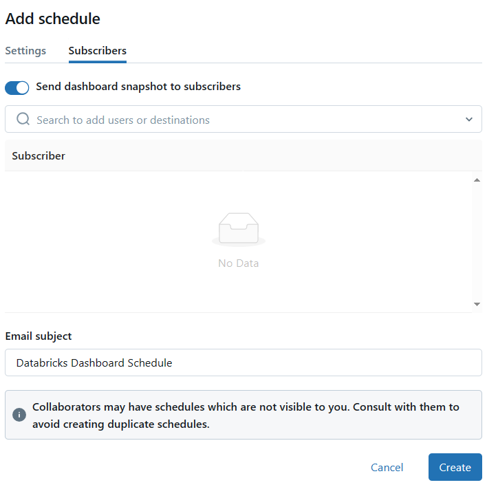
To set up an automatic refresh schedule for your dashboard, click the "Schedule" button in the top-right corner. In the "Schedule" dialog, you can configure the refresh frequency, time zone, and other settings. You can also specify a SQL warehouse to be used for the scheduled refresh, which can be different from the one used for manual refreshes.
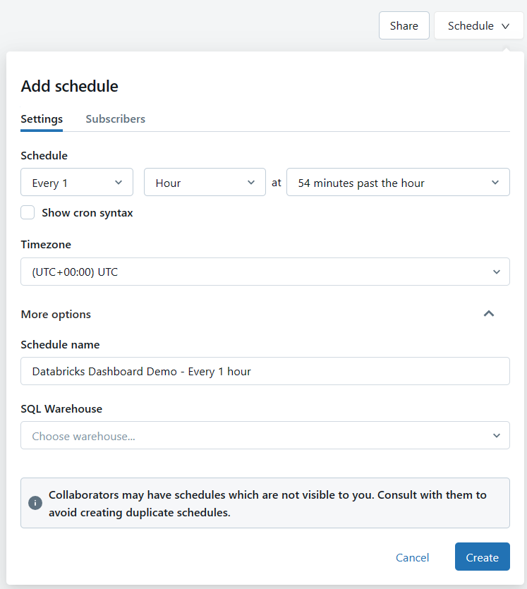
On top of that, you can also add email subscribers who will receive notifications when the dashboard is automatically updated.
Step 15—Export and Download the Databricks Dashboard
Exporting your Databricks dashboard as a PDF is straightforward! Just click on the Kebab menu in the top-right corner of the dashboard and choose "Download as PDF" from the dropdown menu. It might take a moment to generate the PDF, but once it's ready, it'll be downloaded straight to your local machine.
Step 16—Sharing the Databricks Dashboard
Sharing your Databricks dashboard is easy! You can share it with others in your workspace or even externally, depending on your organization's access settings.
1) Sharing within your workspace:
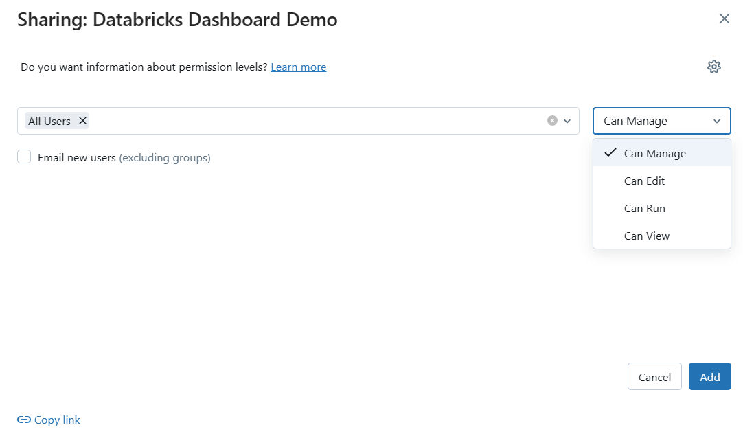
To share your dashboard with other users in your workspace, just click the "Share" button in the top-right corner. In the "Sharing" dialog, you can add individual users or groups and give them specific permissions, like "Can View", "Can Edit", “Can Run” or "Can Manage".
2) Sharing externally:
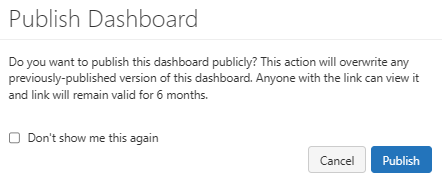
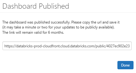
If you're using Databricks Community Edition or your organization allows publishing notebooks, you can share the dashboard externally. Click the "Publish" button, select the "Publish" option from the popup, and Databricks will generate a shareable link that you can send to your colleagues or stakeholders.
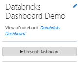
If you've followed all the steps outlined above, your completed dashboard should now look similar to this => Databricks Dashboard Demo.
Step 17—Deleting the Databricks Dashboard
If you ever need to delete your Databricks dashboard, don't worry! The process is simple. Here's how to do it:
1) For Databricks Enterprise Users:
Just click on the three-dot "kebab" menu (...) at the top-right corner of the dashboard and select "Move to Trash" to delete the dashboard.
2) For Databricks Community Edition Users:
Head over to your dashboard and look for the "Delete this dashboard" button. Once you find it, click on it, and your dashboard will be permanently deleted.

Well, that's a wrap! We've covered everything you need to know about managing and controlling your Databricks dashboard. With this handy guide, you're ready to make the most of your dashboard experience. Happy dashboarding!
Want to take Chaos Genius for a spin?
It takes less than 5 minutes.

Conclusion
And that's a wrap! Databricks dashboard is an essential tool for anyone who works with data, including engineers, data analysts, business professionals, and decision-makers. It enables you to convert unstructured data into valuable insights and make smarter, data-driven decisions. Prepare to use the Databricks dashboard to unleash the power of your data!
In this article, we have covered:
- What Are Databricks SQL Dashboards?
- Available Dashboard Options in Databricks (including Lakeview)
- Key Differences Between Databricks SQL Dashboards and Lakeview Dashboards
- A Step-by-Step Guide to Creating a Databricks SQL Dashboard (using a notebook-based approach)
…and so much more!
FAQs
What is Databricks Dashboard?
Databricks dashboard is a powerful data visualization and analysis tool that allows users to create interactive, visually appealing dashboards within the Databricks ecosystem.
What are the two primary options for creating and managing dashboards in Databricks?
The two primary options are Databricks SQL dashboards and Databricks Lakeview dashboards.
What are the key differences between Databricks SQL Dashboards and Databricks Lakeview Dashboards?
The key differences include integration with the Databricks notebook environment, visualization engine, data governance, and target user audience.
How do you create a Databricks Notebook?
To create a Databricks Notebook, you go to the Workspace section, find the right folder, click Create, and then choose Notebook.
How do you add a visualization to a Databricks Dashboard?
In the notebook, you click the drop-down menu on the visualization and select "Add to dashboard", then choose the dashboard you want to add it to.
What are the key chart types available in Databricks Dashboards?
Databricks dashboards offer a variety of chart types, including bar charts, line charts, scatter plots, maps, pie charts, bubble charts, and more.
How do you handle missing values and data cleaning in Databricks Dashboards?
You can preprocess and refine the data by cleaning up missing values, converting data types, and creating new derived columns using SQL queries.
How do you clone a Databricks Dashboard?
Open the kebab menu at the top-right corner of the dashboard, select Clone, enter a name, and click Confirm.
How do Databricks Widgets enable interactive filtering in Dashboards?
Databricks Widgets, such as Text Input, Dropdown, Combo Box, and Multiselect, allow users to update the dashboard with different parameters to enable interactive data exploration.
How can you customize the layout and appearance of a Databricks Dashboard?
You can rearrange and resize the dashboard elements, adjust the layout options (Stack or Float), and add formatting, labels, and titles to the visualizations.
How do you manage the refresh schedule for a Databricks Dashboard?
You can set up automatic refresh schedules for a dashboard, specifying the frequency, time zone, SQL warehouse, and email subscribers to receive update notifications.